OUR PET POLICY
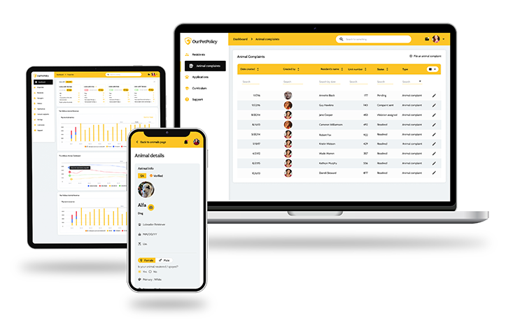
OurPetPolicy is an online pet management and ESA verification platform for property owners and managers to oversee tenants' pets residing on their properties.
Pet Management and ESA Verification Platform
Project summary
OurPetPolicy is an online pet management and ESA verification platform for property owners and managers to oversee tenants' pets residing on their properties. OurPetPolicy helps residential property owners maximize revenue, save time and money, and streamline the tenant-rental experience in regard to pets. The platform is a fully-featured pet management solution that empowers property managers with the tools to identify unauthorized animals and fraudulent ESA requests in their rentals.
Problem statement
The system takes care of the entire pet management process from pet registration up to legal regulations.

The Process
-
01.
User jurney mapping - The platform enables multi-level user access. With the help of its easy-to-use functional tenants, property owners, property managers and system administrators acquire full control over pet-related information flow and contract management.
Wireframeing - The process reduces unauthorized pets, fraudulent ESAs, and educates tenants on the responsibilties required when renting with pets. Wireframing stage helped to understand the main functional flows and to identify the major scope of each user level. -
02.
After confirming the details, the final UI ready designs and prototypes were created and initial user testing sessions began. The results were really promising and no critical issues were discovered. Thus after some minor polishing the designs were handed off for development.
The solution
- Thus, most of the users who participated in the research mentioned that they were really fond of the style of the website, the look-and-feel and the UI. However, they mentioned ads to be a distractive element for their reading experience. Furthermore, they would also like to have more whitespace on the pages that would also help them focus. Fonts were another thing they mentioned to be a drawback as it was difficult to read the posts because of those.
- Having taken all of the qualitative data gathered during the research phase we came up with a modern and robust platform design that was based on legible reading experience. The section visibility issues were eliminated and ads were distributed in a more logical and user-friendly way, as well as aspects like the placement of subscription buttons were revised. The updated navigation now allows to easily browse and find anything in a click.
