CANADA'S #1 IPHONE BLOG
The latest iPhone news, reviews, tips and mobile news for Canadian iPhone users.
Canada's #1 iPhone Blog
Project summary
iPhoneinCanada.ca is a blog started in late 2007 as an independent online news source, documenting the use of the first-generation iPhone in Canada, a rarity at the time. The site has evolved along with the iPhone and they are a leading news authority for anything Apple and technology-related that’s relevant to Canadians–and tech deals. They also cover emerging technology trends and mobile news, including anything related to their incumbent carriers Rogers, Telus and Bell.
Problem statement
The website had gained significant traffic when the need for redesign emerged. The main issues with the previous version were the lack of quick access sections like “Most viewed posts” and “Trending posts”. Another essential function that the previous version didn’t support was the possibility to leave comments under the posts and to develop readers’ communities. In addition, the individual post pages needed to be more illustrative and encompass more information and graphics in an optimal way.

The Process
-
01.
The first thing that we started off with was an in-depth user research to be able to understand the main user needs apart from the ones that were already identified by the founders. It was important to understand what parts were easy to use and useful for the users and which parts they’d rather have updated.
-
02.
After having gathered all the required data the user journey maps were sketched with the help of which we could outline the possible gaps in the existing flow. Further everything was translated into low fidelity wireframes to be able to discuss the changes with the stakeholders. After confirming the details, the final UI ready designs and prototypes were created and initial user testing sessions began. The results were really promising and no critical issues were discovered. Thus after some minor polishing the designs were handed off for development.
The solution
- Thus, most of the users who participated in the research mentioned that they were really fond of the style of the website, the look-and-feel and the UI. However, they mentioned ads to be a distractive element for their reading experience. Furthermore, they would also like to have more whitespace on the pages that would also help them focus. Fonts were another thing they mentioned to be a drawback as it was difficult to read the posts because of those.
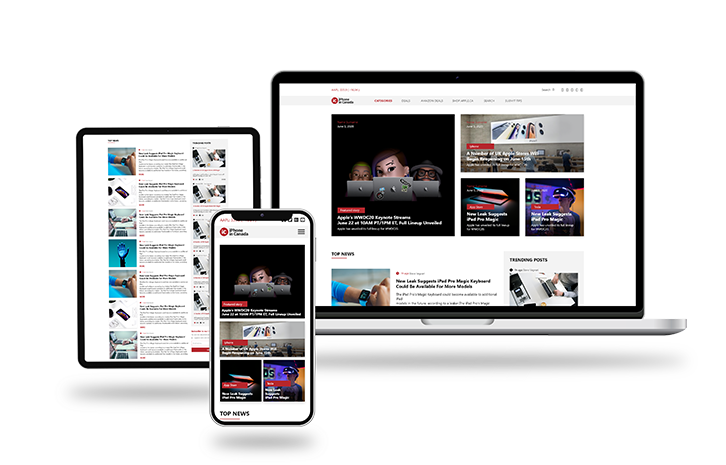
- Having taken all of the qualitative data gathered during the research phase we came up with a modern and robust platform design that was based on legible reading experience. The section visibility issues were eliminated and ads were distributed in a more logical and user-friendly way, as well as aspects like the placement of subscription buttons were revised. The updated navigation now allows to easily browse and find anything in a click.
