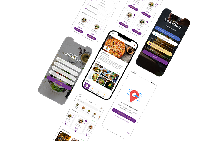
FOOD MAKING AND DELIVERY PLATFORM
Lokaaly has grown from a home project to one of the largest food aggregators in the world. They are present in 24 countries and 10000+ cities globally, enabling their vision of better food for more people.
Food making and Delivery Platform
Project summary
Lokaaly brings together home chefs and customers. Their mission is to provide the former with a good-looking and easy-to-use platform to present their goods and dishes to the market. Thus, the customers also gain access to healthy and delicious food. So, the main function of the platform is to bring the top home chefs closer to their customers.
Problem statement
Since the Instagram page was already functioning and had gained solid audience, the number of orders was exceeding the limit of manageable. The company made a strategic decision to invest in creating an online ordering platform that would make the process much smoother and more seamless. Furthermore, a need to create the mobile app for mobile users emerged as well.

The Process
-
01.
First of all, we held a number of discover and brainstorming sessions with the stakeholders and surveys with potential customers of the platform to be able to clearly identify the target users and their most important needs.After having all the UI elements in place, we passed to developing the design system and the final prototype based on the actual UI components. After successfully conducting and analyzing the final user testing data, the desktop variant of the product was built and launched.
-
02.
However, what many of the users mentioned was that they’d rather have a compact and robust mobile app at hand because that’s what they use most during the day.That’s why we passed to the creation of the mobile application. The iterations were pretty similar including research, user journey mapping, low fidelity wireframing and testing, and finally, because the main UI elements were ready, we conducted the final testing sessions and handed the design over to development team.
The solution
- After analyzing the data collected during those sessions and matching them with the competitive analysis data, we went on crafting the main user journey maps.
- After that we worked through the UI elements that included the following colors:
Purple
#74368C
Yellow is a color associated with sun. It symbolizes optimism, energy, joy, happiness and friendship.
Yellow
#F0D283
Purple combines the calm stability of blue and the fierce energy of red. The color purple is often associated with royalty, nobility, luxury, power, and ambition.
