Ricelly
Cookbox, that gives rice lovers the ultimate mess-free, healthy and restaurant-style cooking experience right in their kitchen. Ricelly delivers high-quality rice, spice, and flavour pots with super simple easy to cook kit for delicious recipes straight to your home.
Healthy rice meal subscription service
Project summary
Ricelly is a new UK-based rice meal delivery that provides high quality and
healthy rice meal subscription service to the customers.
Our appetite for rice seems insatiable. Rice eaten per person per week
has grown 45% since the 1970s with a staggering 90% of UK householders
buying rice. The industry is a vibrant and continuosly developing. There are
more indian restaurants in the UK than any other cuisine except British.
Problem statement
Company is trying to solve "what's for dinner tonight" dilemma in UK/Europe householders by providing easy cooking rice meal kits to easy cooking burden with all ingredient easy, non-messy delicious rice recipes cooking techcnique.The market research revealed that the competition in this niche is still not tough so the main thing the business needed was an illustrative and user-friendly website that would nicely present all the meals offered with their clear descriptions and benefits outlined. In addition, the structure and the navigation of the website needed to be simple and robust to allow for quick and effortless browsing experience.
The Process
-
01.
What followed the research stage was the creation of high fidelity prototypes for presenting them to the client ant to the users for testing. Based on the users’ feedback, the meal box cards were updated and made more informative.
-
02.
Since the website was also meant to support online ordering, the shopping experience specifications of the customers was to be taken into account as well. One more focus was to be put on the subscription system.
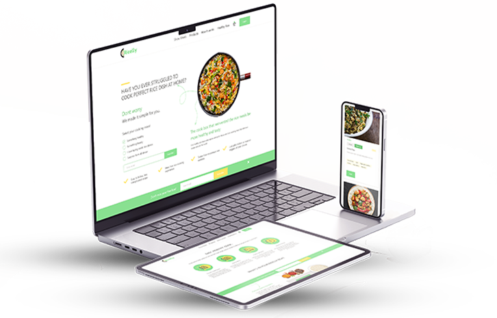
The solution
- The website was thus created based on the research data and the clients’ requirements. It’s using bright and saturated colors to create a positive and inviting atmosphere for the customers. The subscription notice was transformed into a dismissible notification in order not to interfere with the users’ browsing.
- From the user experience perspective, we’ve made the sign-up flow as easy and quick as possible. In addition, the searching and filtering functions were rebuilt to allow the customers to find all they need in a click.